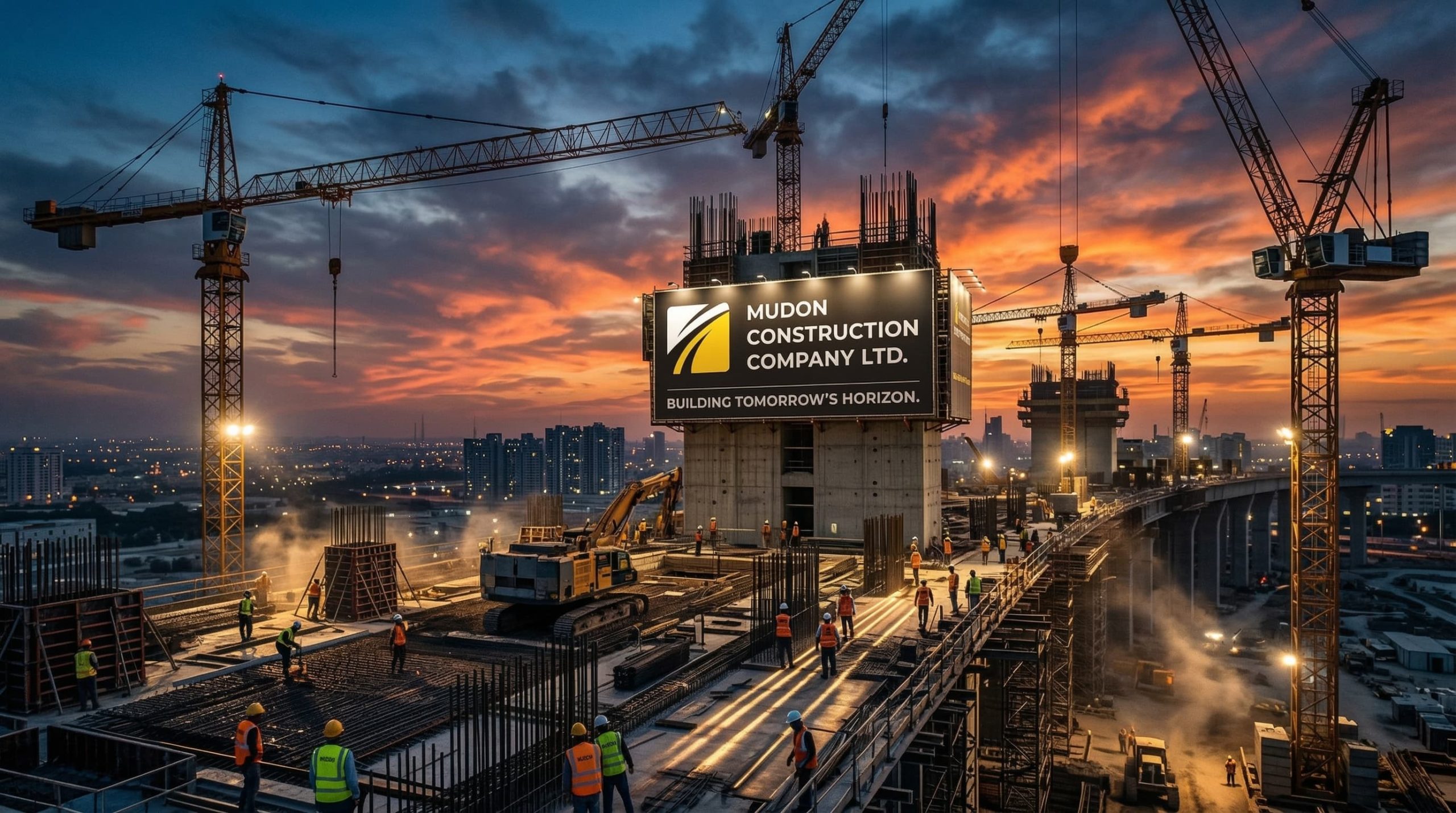
When Mudon Construction came to us, they were operating in one of the most brand-indifferent sectors in the region — and that was precisely the opportunity.
The Myanmar construction market in the period of significant infrastructure and development activity was crowded with contractors of varying scale, capability, and reliability. The buyers awarding the contracts that mattered — property developers, real estate principals, government procurement bodies, institutional operators — had a consistent challenge: almost every contractor on the shortlist looked the same. Same visual language. Same corporate profile structure. Same signals of undifferentiated local capability.
In this environment, the selection decision defaults to relationships and to price, because nothing about the brand landscape gives procurement teams a better criterion to use. The contractor whose brand makes the selection feel professionally defensible — whose materials communicate that choosing them is a defensible decision — has a structural advantage that has nothing to do with whether they’re actually the best builder on the list.
Mudon had the delivery track record and the operational scale to compete for developer and institutional contracts at a meaningful tier. The brand was placing them in the local-contractor category at the point in the evaluation where that categorisation sticks.
They weren’t losing because of their capability. They were losing the shortlist before their capability was ever evaluated.
We recognised that the brand’s job in this context was not to describe what Mudon did — it was to communicate the kind of company they were, at the visual and verbal register that gives procurement committees confidence to advance a relationship.
Client
Mudon Construction Co.LTD – Yangon, Myanamar

The Situation
A construction company operating in a market where the sector is crowded, contractor brands are largely undifferentiated, and the ability to command preferred-partner status with developers and institutional clients depends almost entirely on the brand’s ability to communicate professional credibility before the tender stage. The company had the operational capability to compete for higher-value contracts. The brand was positioning them as a local contractor.
The Challenge
Construction sector branding in emerging markets almost universally defaults to the same visual signals: generic colour palettes, unfocused marks, corporate materials that are interchangeable between competitors. The result is a procurement environment where buyers default to relationships and price because no brand has given them a better criterion to use. The companies that win developer and institutional contracts in this environment are not necessarily the most capable — they are the ones whose brand makes the selection decision feel professionally defensible.
The Results:
What We Built A corporate identity system built around the visual and verbal signals of institutional credibility — the kind of brand that makes a developer or government procurement team feel their decision is supportable to their own stakeholders. Identity, stationery, and profile materials designed to perform in formal commercial environments rather than local advertising contexts. The strategic intent: take Mudon from the local-contractor category into the institutional-partner category without misrepresenting what the firm is.
The Outcome Repositioned the firm’s brand presence from local construction contractor to credible institutional partner capable of competing for developer and government procurement at a tier the previous brand could not access. The visual system produced an immediate shift in how the firm was perceived at initial commercial contact — the stage that determines whether a more detailed evaluation follows.
What This Proves In sectors where every competitor looks identical, differentiation through brand is disproportionately rewarded. When one firm looks materially more credible than the rest, the shortlist decision tends to make itself.
Get a Big Picture Brand Review in 20 Minutes
Is Your Brand Persuading or Just Presenting?
Most brand opportunities aren’t visible from the inside. The positioning that could work harder for the company you are now. The messaging with clearer articulation that could accelerate decision velocity. The identity that, strengthened in the right places, would better signal the level you’re already operating at.
The Brand Gravity Momentum Session™ is a free, 20-minute live working consultation. We look at your website, pitch materials, and key assets in real time — and identify the 3 to 5 areas with the greatest commercial opportunity. Where your brand could work harder, where clearer signal would reduce evaluation time, and where a targeted change would have the most impact on pipeline, pricing, or close rate. You leave with a clear picture of where the highest-value opportunities sit — and a recommended path to capture them.


